Data Visualization Trends in 2025
In today’s data-driven world, effective data visualization has become essential for understanding complex information and making informed decisions. As technology continues to evolve, so do the trends in data visualization. Looking ahead to 2025, several key trends are set to shape the landscape of data visualization. Let's explore them together.
DATA VISUALIZATION
3/29/20254 min read

Artificial intelligence (AI) is revolutionizing many aspects of our lives, and data visualization is no exception. AI-driven features are becoming increasingly common in data visualization tools, enabling automated insights and natural language processing for querying data. For instance, platforms like Tableau and Microsoft Power BI are integrating AI to provide users with predictive analytics and anomaly detection, allowing them to uncover hidden patterns in their data without extensive manual analysis.
AI not only enhances user experience but also empowers users to interpret data more effectively without requiring extensive technical expertise. For example, AI algorithms can analyze historical data trends and suggest optimal visualizations tailored to the specific dataset, making it easier for users to create impactful visuals. Additionally, natural language processing allows users to ask questions about their data in plain language, receiving instant visual responses, which democratizes access to data insights.
Interactive and Real-Time Dashboards
The demand for interactive and real-time dashboards is on the rise, driven by the need for businesses to make quick, data-informed decisions. Traditional static reports are being replaced by dynamic dashboards that allow users to engage with data in real-time. This shift enables organizations to respond swiftly to changing conditions and gain immediate insights into their performance metrics.
Tools like Tableau, Power BI, and Looker are leading the charge in providing users with the ability to manipulate data visualizations interactively. Users can filter data, drill down into specifics, and visualize different perspectives all in real-time. For example, a sales team can monitor live sales data, adjusting strategies on the fly based on current performance indicators. This capability not only enhances decision-making but also fosters a culture of data-driven management across organizations.
Data storytelling is gaining traction as a powerful method to convey insights effectively. By combining narrative techniques with data visualization, professionals can create compelling stories that resonate with their audience. Effective storytelling involves a clear narrative flow, context, and emotional engagement, making complex data more relatable and understandable.
For instance, organizations like Google and The New York Times have mastered the art of data storytelling, using visuals to complement their narratives. By presenting data in a way that highlights key messages and insights, they can engage their audience more deeply. Techniques such as using visuals to illustrate trends over time or employing infographics to summarize data findings are becoming increasingly popular. This approach not only helps in communicating findings but also aids in retaining audience attention and fostering a better understanding of the data.
Storytelling with Data
Enhanced Accessibility and Inclusivity
As the importance of inclusivity grows, data visualization is becoming more accessible to diverse audiences. Designers are increasingly recognizing the need for inclusive design practices, ensuring that visualizations can be understood by everyone, regardless of their abilities. This trend is crucial, as it aligns with broader societal goals of equity and inclusion.
Accessibility features include colorblind-friendly palettes, which ensure that visualizations are interpretable by individuals with color vision deficiencies. Additionally, providing alternative text descriptions for visuals and ensuring compatibility with screen readers are essential practices. Tools like Tableau offer features that help designers create accessible dashboards, while resources such as the Web Content Accessibility Guidelines (WCAG) provide guidelines for best practices in accessibility.
Furthermore, organizations are increasingly prioritizing inclusive design in their data visualization strategies. By considering the needs of diverse audiences, they can create more effective and engaging visualizations that resonate with a wider range of viewers.
Augmented and Virtual Reality (AR/VR) in Data Visualization
Augmented and virtual reality technologies are making their way into data visualization, offering immersive experiences that enhance understanding of complex data sets. AR and VR enable users to visualize data in three-dimensional spaces, allowing for a more intuitive exploration of information.
Industries such as healthcare, education, and finance are exploring AR and VR applications to visualize data in new and engaging ways. For example, in healthcare, VR can be used to visualize complex anatomical structures, helping medical professionals understand patient data more effectively. In education, AR can bring historical data to life by overlaying visualizations on real-world environments, making learning more interactive and engaging.
These immersive technologies allow users to interact with data in ways that traditional 2D visualizations cannot, leading to deeper insights and a more comprehensive understanding of the information presented.
Data Ethics and Transparency
With the increasing reliance on data, there is a growing awareness of the ethical implications of data visualization. Data ethics encompasses the principles of fairness, accountability, and transparency in the use of data. As organizations strive to build trust with their audiences, transparency in data sources and methodologies is becoming paramount.
Trends towards ethical storytelling and responsible data use are emerging, as professionals aim to present information accurately and fairly. This includes being transparent about the limitations of data, acknowledging biases in data collection, and ensuring that visualizations do not mislead the audience. Organizations are implementing guidelines and best practices for ethical data visualization, emphasizing the importance of integrity in data presentation.
Furthermore, as data privacy concerns grow, there is an increasing focus on ensuring that data visualizations respect individual privacy and comply with regulations such as GDPR. By prioritizing ethical considerations, data professionals can foster a culture of responsibility and trust in their work.
Conclusion
As we look toward 2025, staying updated on these trends in data visualization will be crucial for data professionals. Embracing AI, interactive dashboards, data storytelling, accessibility, AR/VR, and ethical practices will not only enhance our understanding of data but also ensure that we communicate insights effectively. Let’s explore these trends and incorporate them into our work to create impactful visualizations that resonate with our audiences.
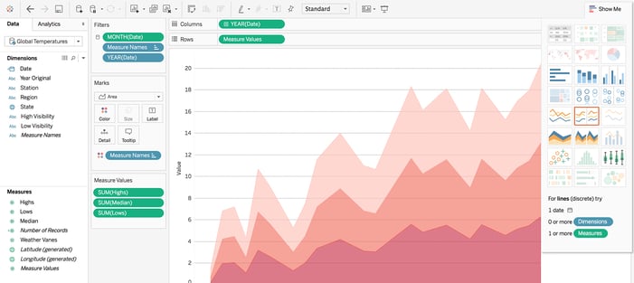
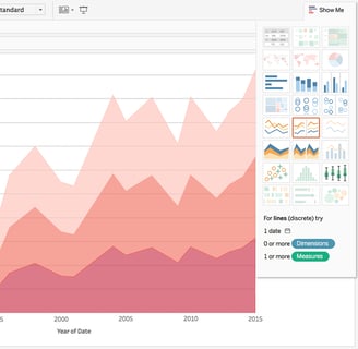
A tableau dashbord.
2022- The Year in Visual Stories and Graphics - The New York Times.
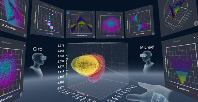
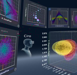
An example of data visualization using the VR technology.
Data-Driven Insights Blog
Exploring data science through articles and dashboards.
Analytics
Research
cortese.claudia@studenti.luiss.it
© 2025. All rights reserved.